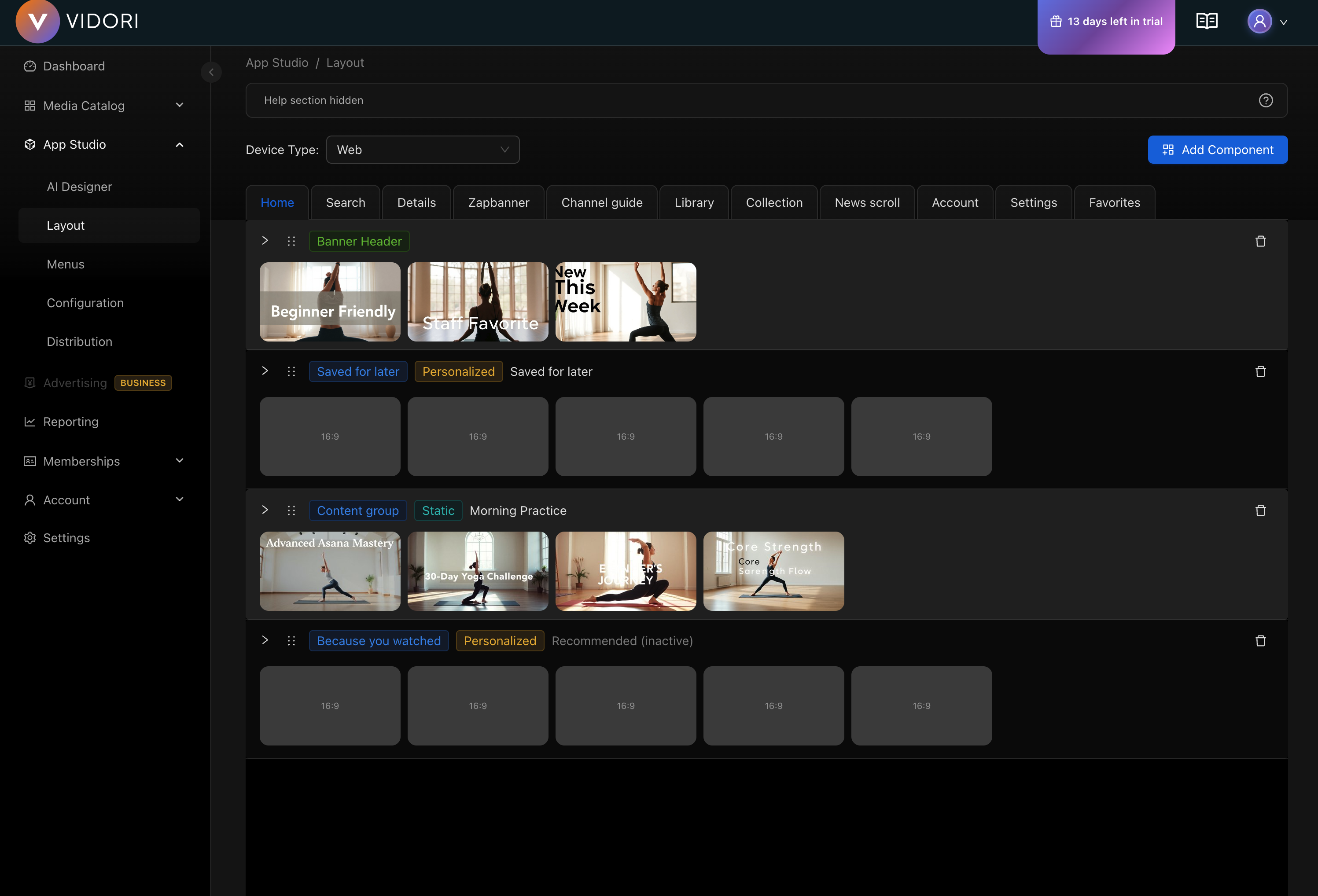
Layout Editor
The Layout Editor lets you design the home screen and other screens for your streaming apps. Different device types can have different layouts to optimize the viewing experience.
Device Types
Section titled “Device Types”Create device-specific layouts for optimal experiences:
| Device | Description | Availability |
|---|---|---|
| Web | Browser-based player | All tiers |
| Phone | Mobile phones | Pro+ tier |
| Tablet | iPad and Android tablets | Pro+ tier |
| CTV | Connected TV apps | Business+ tier |
Screen Types
Section titled “Screen Types”Configure layouts for different screens in your app:
- Home Screen - Primary landing page
- Movies - Movie browse screen
- Series - Series browse screen
- News - News content screen
- Live TV - Channel guide
- Search - Search results
- Favorites - User’s saved content
- Library - User’s purchased/rented content
Layout Components
Section titled “Layout Components”Content Components
Section titled “Content Components”| Component | Description |
|---|---|
| Swimlane | Horizontal scrolling row of content |
| Grid | Multi-row content display |
| Banner | Promotional banner display |
| Hero | Large featured content carousel |
User Components
Section titled “User Components”| Component | Description |
|---|---|
| Continue Watching | Resume where user left off |
| Favorites | User’s saved content |
| Recommended | Personalized suggestions |
Live Components
Section titled “Live Components”| Component | Description |
|---|---|
| Channel Swimlane | Horizontal row of live channels |
| Live Now | Currently airing content |
| Stock Ticker | Scrolling information bar |
Editing a Layout
Section titled “Editing a Layout”-
Select Device Type
Use the device selector at the top to choose which platform you’re designing for.
-
Choose a Screen
Select the screen you want to edit (Home, Movies, Series, etc.).
-
Add Components
Click Add Component to open the component picker. Select the component type you want to add.
-
Configure Component
After adding, configure the component:
- Set a title (supports multiple languages)
- Choose content source (group, tag, or automatic)
- Set display options (number of items, style)
-
Reorder Components
Drag components up or down to change their order on the screen.
-
Preview and Save
Use the preview to see how your layout looks, then save your changes.
Component Configuration
Section titled “Component Configuration”Swimlane Settings
Section titled “Swimlane Settings”- Title - Display name shown above the row
- Content Source - Group, tag, or automatic (Popular, New, etc.)
- Item Count - Maximum items to display
- Style - Poster, landscape, or square thumbnails
Banner Settings
Section titled “Banner Settings”- Banner Source - Select which banners to display
- Auto-Scroll - Enable automatic rotation
- Interval - Seconds between banner changes
Grid Settings
Section titled “Grid Settings”- Columns - Number of columns per row
- Rows - Number of visible rows
- Content Source - Same options as swimlanes
Device-Specific Tips
Section titled “Device-Specific Tips”CTV Layouts
Section titled “CTV Layouts”- Use larger thumbnails for viewing distance
- Limit swimlanes to 5-7 items visible
- Ensure focused state is clearly visible
- Test with remote navigation
Mobile Layouts
Section titled “Mobile Layouts”- Stack components vertically
- Use touch-friendly sizing
- Consider portrait and landscape
- Enable swipe gestures
Web Layouts
Section titled “Web Layouts”- Maximize screen real estate
- Support mouse hover states
- Consider responsive breakpoints
- Optimize for keyboard navigation
Copying Layouts
Section titled “Copying Layouts”You can copy a layout from one device to another:
- Select the source device
- Click Copy Layout
- Choose the target device
- Adjust as needed for the new platform
This saves time when creating similar layouts across devices.